When you need your Canva® printed for distribution or mailing, call us. We know how to make it work. "Ready to take your Canva® designs from pixels to paperwith an order of 2500 or more? Look no further! When it's time to bring your creations to life with high-quality printing and seamless distribution, we've got you covered. Our team specializes in turning your digital masterpieces into tangible assets that leave a lasting impression. Whether you're promoting your business, organizing an event, or spreading the word about a cause, we have the expertise to make it happen. Say goodbye to printing headaches and hello to hassle-free solutions. Let's turn your vision into reality – contact us today! We love Canva® Who said you need a premium Canva® account to bring your vision to life? At Greenway, we believe everyone deserves to see their creativity flourish. Simply share your artwork with us at [email protected], and we'll work our magic to ensure it prints beautifully and looks absolutely stunning. No matter the complexity, we've got the expertise to refine your designs and make them shine. Let's transform your ideas into captivating prints – send us your art today. Send to [email protected] or call 602.482.1142.
0 Comments
Effective communication and outreach are vital components for success in any political campaign. "Door to Door Votes", a division of Greenway Print Solutions. provides great design and printing for door hangers, flyers, and postcards
We provide the power of physical engagement in a digital world. Tangible marketing materials that reach voters where they are most receptive - their homes. We provide an unmatched dedication to impactful design. with eye-catching visuals, persuasive messaging, and incorporating campaign branding. Recognizing that first impressions matter, each piece of campaign collateral is top quality at reasonable pricing. We offer a wide range of customizable solutions to cater to the diverse needs of most political candidates. Large scale to small scale. We also provide SMS, MMS and video calling. All of this at very reasonable pricing. Call Alan at 602.482.1142 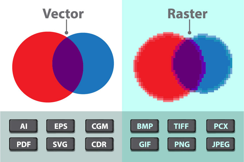 What they look like when expanded. When it comes to printing, vector and bitmapped images are both popular choices. But what is the difference between the two, and which should you use for your project?
Vector images are made up of shapes, lines and curves, and are generated using mathematical equations. Because of this, they can be scaled up or down as much as you like without losing any quality. This makes them ideal for logos and illustrations, as they will look the same no matter what size they are printed at. Vector images also tend to have smaller file sizes than bitmapped images, so they can be sent more easily over the internet. Bitmapped images, on the other hand, are made up of individual pixels. This means that when you scale them up, the image will become blurry and distorted. Bitmapped images are best for photographs and complex graphics, as they can capture a lot of detail. They tend to have larger file sizes than vector images, so they may take longer to send over the internet. When it comes to printing, vector images are generally the preferred choice. They are crisp and clear, no matter what size they are printed at, and they have smaller file sizes. Bitmapped images are best for photographs and complex. Source: ChatGPK AI 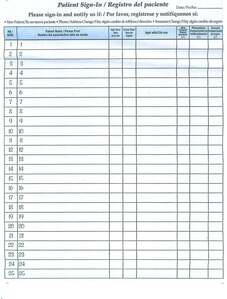 Patient sign-in sheets are an important tool in the healthcare industry, serving a variety of purposes for both patients and healthcare providers. In this blog post, we'll explore the benefits of patient sign-in sheets and discuss best practices for using them in your practice. First and foremost, patient sign-in sheets serve as a record-keeping tool. By logging the time that a patient arrives at a healthcare facility, providers can track wait times and ensure that they are seeing patients in a timely manner. Sign-in sheets also allow healthcare providers to track the flow of patients through the facility, which can be helpful in identifying bottlenecks or areas of high patient volume. In addition to record-keeping, patient sign-in sheets can also help to improve patient privacy and security. By requiring patients to sign in with their name and date of birth, healthcare providers can ensure that they are seeing the correct patient and can protect patient information from being accessed by unauthorized individuals. There are a few best practices to keep in mind when using patient sign-in sheets. First, it's important to make sure that the sign-in sheet is placed in a convenient and accessible location, such as a front desk or reception area. This will make it easy for patients to sign in as they arrive. It's also important to make sure that the sign-in sheet is clearly labeled and easy to read. This will help to reduce confusion and ensure that patients are able to accurately sign in. In addition, it's a good idea to periodically review the patient sign-in sheet to identify any trends or patterns. For example, if you notice that a particular patient is consistently late for appointments, you may want to reach out to them to discuss the issue and see if there are any ways to improve their punctuality. Overall, patient sign-in sheets are a useful tool for both patients and healthcare providers. By tracking patient arrival times and improving patient privacy and security, these sheets can help to improve the overall patient experience and ensure that patients receive the best possible care. Fun, unique and useful. Grow your brand and create a buzz.
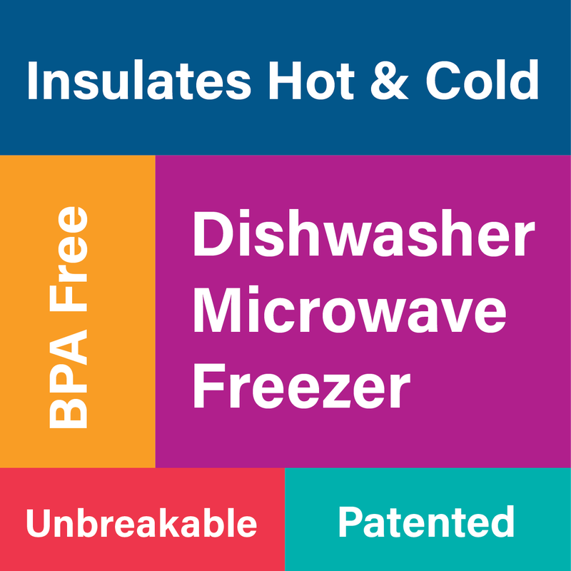
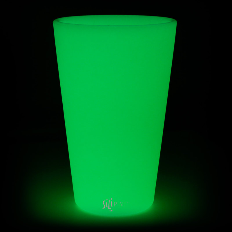
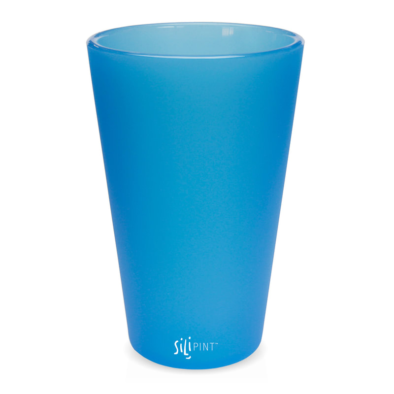
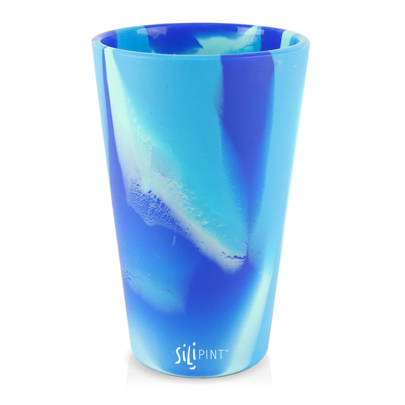
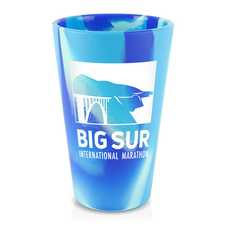
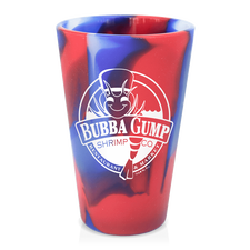
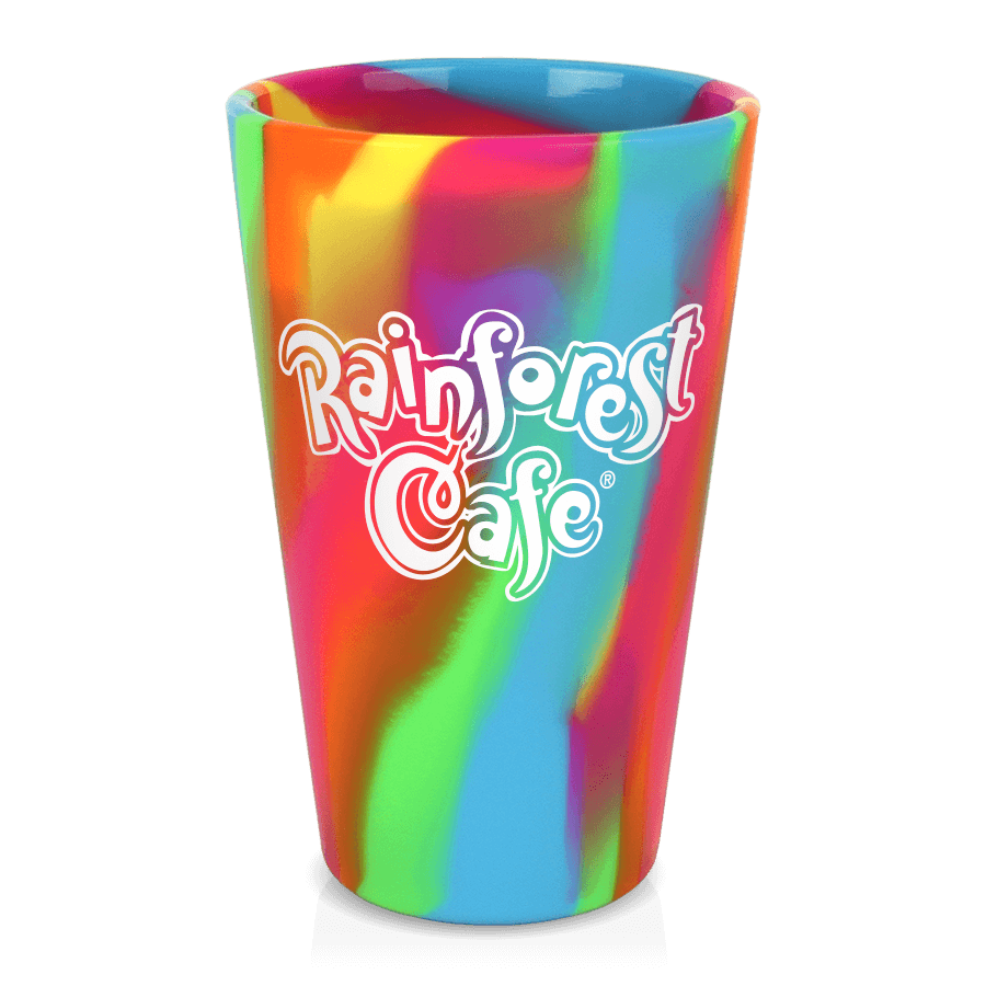
 SILICONE PINT GLASSES For thirsty folks across the land, 16 ounce silicone pints are more than a rugged alternative to the beer glass. From the patio to the campground, beach vacation or daily commute, these colorful, versatile drinking glasses are as flexible in shape as they are in utility. Our true American pint sized silicone cups have thick and sturdy, yet squeezable walls that are not too squishy, and a grippy outer surface for extra safety. These 16oz silicone pints are more than a rugged alternative to the beer glass. They are an unbreakable way to keep your cold drinks cold and your hot drinks hot. From the patio to the campground, on cross-country road trips or your daily commute, these 16 oz pints are a reusable alternative to plastic, paper, and styrofoam cups. Fill them with something tart and tangy, sweet and juicy, or just plain water. Made of 100% FDA-Approved, BPA free silicone, these pints are dishwasher, microwave, oven, and freezer safe. 100% Food-grade silicone, a non-petroleum based polymer derived from silica FDA-approved BPA-free Microwave-safe Dishwasher-safe Freezer-safe Insulates Hot & Cold Withstands temps -58 C up to 650 F Silicone-based inks will not wear off, chip or fade Outer surface is grip honed, inner surface is polished smooth Patented by Silipint® Will not break, crack, chip, fade or scratch Sturdy enough to hold liquids, flexible enough to carry in your pocket Perfect companion for indoor & outdoor dining, camping, tailgating, commuting Reusable cup reduces waste
Features:
Printed one side, one color f.o.b. plant Call Alan 602.482.1142.
 The following is from the October 2021 issue of PS magazine, a publication from the Brand Chain community. Note that we excel in five of the seven. 1. BUSINESS CARDS
Business cards and letterhead. Even in the digital era, printed communication materials share key information and represent your company’s brand. 2. BROCHURES The importance of high-impact informational and marketing materials cannot be understated. Well designed and useful brochures can make a positive and memorable impression that leads to new opportunities. 3 LABELS AND TAGS It’s hard to identify a business or industry that does not use labels or tags — from medical and pharmaceutical to retail and hospitality. Having these in your product portfolio provides a solid foundation for sales to new and existing customers. 4 PACKAGING Custom-printed packaging with captivating designs can elevate brand recognition and be a strong promotional tool. This is evident across industries but especially notable in the grocery business, where product packaging is a big driver of consumer purchases. 5 FOLDER AND BINDERS These products have high organizational utility internally (e.g., containing and protecting documents) and externally (e.g., marketing and educational tools), and orders have grown in some markets. (See the feature story in the September 2021 issue for more on this trending topic.) 6. LARGE FORMAT From signage and posters to vinyl banners and cardboard stand-ups, going big makes an impact. Wide-format printing is a growing category of work for companies that have invested in the technology required to deliver it. 7. PROMOTIONAL PRODUCTS Company-branded products from notepads to coffee mugs and much more are proven marketing awareness tools to mail or handout, and orders of them likely will increase as in-person trade shows and other events resume.  Plain Black If you have large black areas on any pieces that you need printed, use Rich Black instead of Black. Rich black is an ink mixture of solid black (100% K) with additional Cyan, Magenta and Yellow ink values. This results in a darker tone than black ink alone. If you print black ink alone, the resulting black may not be as dark as you want.. To create Rich Black make your color values: 60% C, 40% M, 40% Y, 100% K Questions? Call Alan @ 602.482.1142  Rich Black 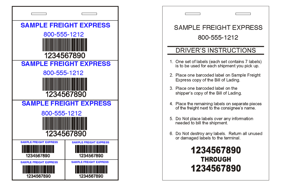 We have the best deal on freight pro labels. Only $1.25 per book (320 book minimum)
These are all 2-3/4" wide books by various lengths, depending on the format. There are 25 sheets per book and all labels print in full color. Barcoding and numbers are included. See our stock formats here. We'll design them for free. Call Al at 602.482.1142 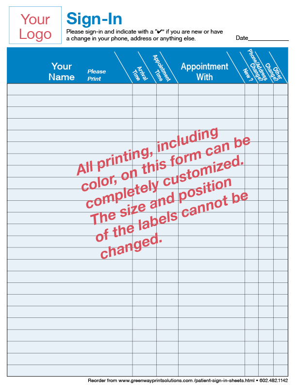 Do you need a sign in sheet for your business that offers ultra privacy - like the sign in sheets that you see in doctors' offices?We've developed the product for you.
We will completely custom design your form at no charge. It has to fit our label format of 25 labels per sheet, but you can print whatever you wish, at very competitive prices. More... 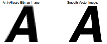 Computer graphics can be created as either raster or vector images. Raster graphics are bitmaps and a bitmap is a grid of individual pixels that collectively compose an image. Raster graphics render images as a collection of countless tiny squares. Each square or pixel is coded in a specific hue or shade. Individually, these pixels are worthless. Together, they’re worth a thousand words.
Raster graphics are best used for non-line art images; specifically digitized photographs, scanned artwork or detailed graphics. Non-line art images are best represented in raster form because these typically include subtle chromatic gradations, undefined lines and shapes, and complex composition. However, because raster images are pixel-based, they suffer a malady called “image degradation.” Just like photographic images that get blurry and imprecise when blown up, a raster image gets jagged and rough. Why? Ultimately, when you look close enough, you can begin to see the individual pixels that comprise the image. Hence, your raster-based image of Wayne Newton magnified to 1000 percent becomes bitmapped before you can isolate that ravenous glint in his eye. Although raster images can be scaled down more easily, smaller versions often appear less crisp or “softer” than the original. Unlike pixel-based raster images, vector graphics are based on mathematical formulas that define geometric primitives such as polygons, lines, curves, circles and rectangles. Because vector graphics are composed of true geometric primitives, they are best used to represent more structured images, like line art graphics with flat, uniform colors. Most created images (as opposed to natural images) meet these specifications, including logos, letterhead, and fonts. Vector Images and the Scalable Truth Inherently, vector-based graphics are more malleable than raster images — thus, they are much more versatile, flexible and easy to use. The most obvious advantage of vector images over raster graphics is that vector images are quickly and perfectly scalable. There is no upper or lower limit for sizing vector images. Just as the rules of mathematics apply identically to computations involving two-digit numbers or two-hundred-digit numbers, the formulas that govern the rendering of vector images apply identically to graphics of any size. Vector Images, Graphics and Raster Further, unlike vector graphics, vector images are not resolution-dependent. Vector images have no fixed intrinsic resolution, rather they display at the resolution capability of whatever output device (monitor, printer) is rendering them. Also, because vector graphics need not memorize the contents of millions of tiny pixels, these files tend to be considerably smaller than their raster counterparts.  A customer called. They had to mail 100,000 letters in two days, by law. Their mailing house was able to get the letters printed (personalized) and stuffed in time but the envelopes they had in stock had my customers first class mail permit. Since these could mail with a presort standard permit, the postage savings would be huge. They asked if we could somehow produce 100,000 envelopes with their presort standard permit so their mailing facility could get the letters out in time.
It’s pretty darn hard to produce 100,000 envelopes in two days, especially when your production schedule is full. After a few phone calls, we performed our first miracle of the year for this customer and will have the 100,000 envelopes produced and delivered on time, saving them over $10,000 in postage. Not bad! That’s what we do. 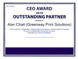 Businesses are always touting they have great customer service and if we were to put all of those touts in a basket, it would be quite a large basket. Yet, proving that a business truly values its customers is another story indeed.
It’s not often that a business or even a business owner receives a whole lot of recognition from a customer, let alone be presented with an award. But in this case, the “proof is in the pudding.” Alan Chait, former owner of Greenway Print Solutions, has always prided himself on customer service and it was the primary reason he left the printing corporate world as an employee to start his own business. He believed he could offer his customers a lot more, not just with a vast array of affordable, quality products, but with superior customer service. To prove it, the story goes: ” Last week I had an appointment with my largest customer, a $200 million company, to review some business forms we are working on. The meeting was supposed to be in their North conference room, but when I arrived nobody was there. Suddenly one of the managers showed up to tell me they had moved the meeting to a conference room in the back and he took me there. In the room were about 200 people, seated and listening to two of the top executives talk about how to use some of the forms I designed for them. In the back was the CEO who, when he saw me, told me to sit down. I told him I’d just wait outside until they were done, but he insisted that I sit and watch the class.” “The CEO suddenly got up, stopped the meeting and told everyone that they had decided to award their Vendor Partners who have been responsible for their success. Of the 10 or so vendors, they voted on who should get the first award, which was me. I had to get up in front of all these people and listen to all the wonderful things that I’ve done for them, my dedication and hard work. Being a little bit of an introvert the “ambush” was an overwhelming surprise and I am very proud to get the award. (Ironically, I was working on pricing out acrylic awards for them to give to their employees, or so I thought. It turns out I’ll be printing my own award.)” The award shows that the foundations that I built Greenway Print Solutions on 30 years ago is alive and well.  Selecting which type of paper to use for your marketing collateral can sometimes be as daunting a task as actually creating the piece. Sure, you can scribble your message on a piece of copy paper and hope that someone is so enthralled with your communication style that they immediately buy from you; however, it’s most likely that your presentation will fall flat when it comes to expectations. In fact, the type of paper you use for your collateral has a lot to do with how people perceive you and your business, so the next time you get ready to print out a brochure or flyer or even your business cards, keep this information in mind.
If Your Business Card Paper is Cheap, So are You That might seem harsh, but if you expect people to buy from you, they will want to know there’s quality in what they are buying. If your business cards are flimsy, people will wonder why you couldn’t spend a few bucks to have them professionally made. You can get free business cards made via the web, but they are usually printed on thin stock (10 point) and have the printing company’s name stamped on the back. Consumers know this and will formulate a perception about you the minute the card reaches their hand. Don’t underestimate the importance of a well-made business card. It’s the first piece of marketing collateral between you and your potential customer. If you’re seriously running a business, using a heavier stock paper for your business cards will not only make your designs stand out, but it will feel better in your customer’s hands, giving them the perception of your professionalism. Go with at least a 14pt or 16 pt card stock. And don’t go for the “free” deals. By the time you pay shipping for those freebies, you could have had a better quality card made for just a few dollars more. Your Flyers and Brochures Don’t Belong on Copy Paper Even if you live in an area that forbids solicitors from leaving their flyers or brochures on your front doorstep, chances are they end up there anyway. My favorite is the landscaper who hopes that I will spend $150 a month to clean my yard, but believes his collateral is worth nothing more than a photocopy of some verbiage on 20lb paper. What crosses my mind? Will he show up? Will he do a good job? Will his business be around a few months from now? It doesn’t even matter if he’s got the best deal in town because that easily crumpled paper has hit the trash can long before that can cross my mind. When designing your brochures and flyers, consider using 80 to 100lb paper which is far heavier than your standard 20lb to 24 lb copy paper. Heavier paper has a much better feel and is perceived of as far more professional, plus it doesn’t crumpled quite as well. Your goal is to have your piece linger in the hands of your customers and potential customers so that it’s handy when they make their call to you to buy. The Different Types of Paper Finish The type of finish you use for your piece should correspond with your brand. The finish pertains to the texture of the paper and can be coated or uncoated.
Weight: Paper has different weights and are denoted in pounds (#). The higher the number, the heavier/thicker the paper. Copy paper or multi-use paper (the paper you stick in your copy machine) is usually 20# paper. Offset paper (known as book or text paper) is commonly used for brochures, greeting cards, postcards, folders and business cards and comes in weights of 50#, 60#, 70#, 80# and 100#. Cover stock paper is heavy and rigid and can also be used for the same type of pieces. They come in 65#, 80#, 100#, 120# and 12pt. Opacity: How opaque a piece of paper is determined by its weight, ingredients and absorbency. This correlates with how much printing will show through on the reverse side of the paper. The opacity is expressed in terms of it’s percentage of reflection; so a piece of paper that is completely opaque is 100 percent and a piece that is completely transparency is zero percent. Brightness: A piece of papers’ brightness is measured by the percentage of a wavelength of blue light it reflects. Brightness is usually expressed on a scale of 1 to 100 with 100 being the brightest. Brightness affects readability, the perception of ink color and the contrast between light and dark hues. So the next time you set out to have your marketing collateral made, give plenty of thought to what you want the final outcome to be – not just what you want it to look like, but what you want it to accomplish. Your marketing collateral is an investment and one that should be treated as such. You’ll yield far better results from a professionally made piece than from one put together on the cheap. And just because you got it for “free” doesn’t mean it won’t cost you in the end. For more information about how you can create professional marketing collateral using the right paper and at an affordable price, contract the pros at Greenway Print Solutions. Several years ago, Xona Resort Suites of Scottsdale came to us looking to spruce up their Guest Check-in Packet. The resort had just completed a multi-million dollar facelift, including the redesign of their logo. Xona’s initial thought when they came to us was to have the Guest Check-in Packet placed within a three-ring binder (turned and sewn leather/leatherette), a similar look that many hotels and resorts leave for their guests in their rooms. Though this approach is oftentimes bland to the guest, it can also be a costly endeavor. Jason Kaller at Greenway Print Solutions had another idea for the resort that would not only include a packet that was appealing to the resort’s guests but would compliment and reinforce their brand. Instead of the boring three-ring binder, Jason suggested they create a mini two-pocket folder using Silk Laminated cover stocks, four-color process printing and Spot UV coating. Plastic hotel key cards, property maps and guest identification tags for luggage were all created to go with this package. Each piece was strategically designed and crafted to compliment the new corporate brand as well as to improve appeal and functionality of the piece. With this new look and innovative display, Jason was actually able to save them money over their original idea using the binder. And the quality of pieces were much higher because we used better paper, more color and upgraded the finishes. Xona was able to implement brand cohesion and because the pieces were of a higher quality, they were extremely durable and could be reused over and over again. Have an idea for a branded corporate piece? Let Greenway Print Solutions help you develop the right pieces and the best price possible. 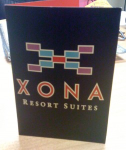 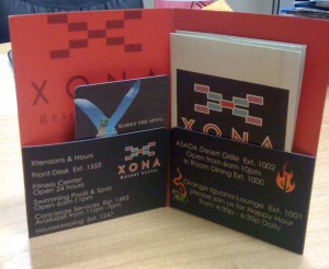  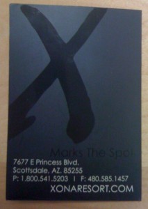 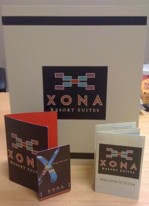 |
- Home
-
Print
- Bar Codes >
- Booklets & Catalogs
- Business Cards
- Extreme Business Cards
- Checks >
- Collection Agency Forms
- Direct Mail /EDDM
- Door Hangers
- Envelopes
- Forms >
- Freight Labels
- Gift Cards
- Insurance Guide Books
- Labels >
- Patient Sign-in Sheets
- Political Printing
- Postcards
- Sign-in Sheets
- Tags
- Ultra Privacy Sign-in Label Sheets, Custom Columns - Designed For Your Business
- Promo Products
- Apparel
- About / Contact
- Customer Specific
- Artwork/Color
- Blog
- EVENT PRINTING ARIZONA

|
GREENWAY PRINT SOLUTIONS
5425 E. Bell Rd., #120 Scottsdale, AZ 85254 602.482.1100 
|
Pay Your greenway invoice here. |